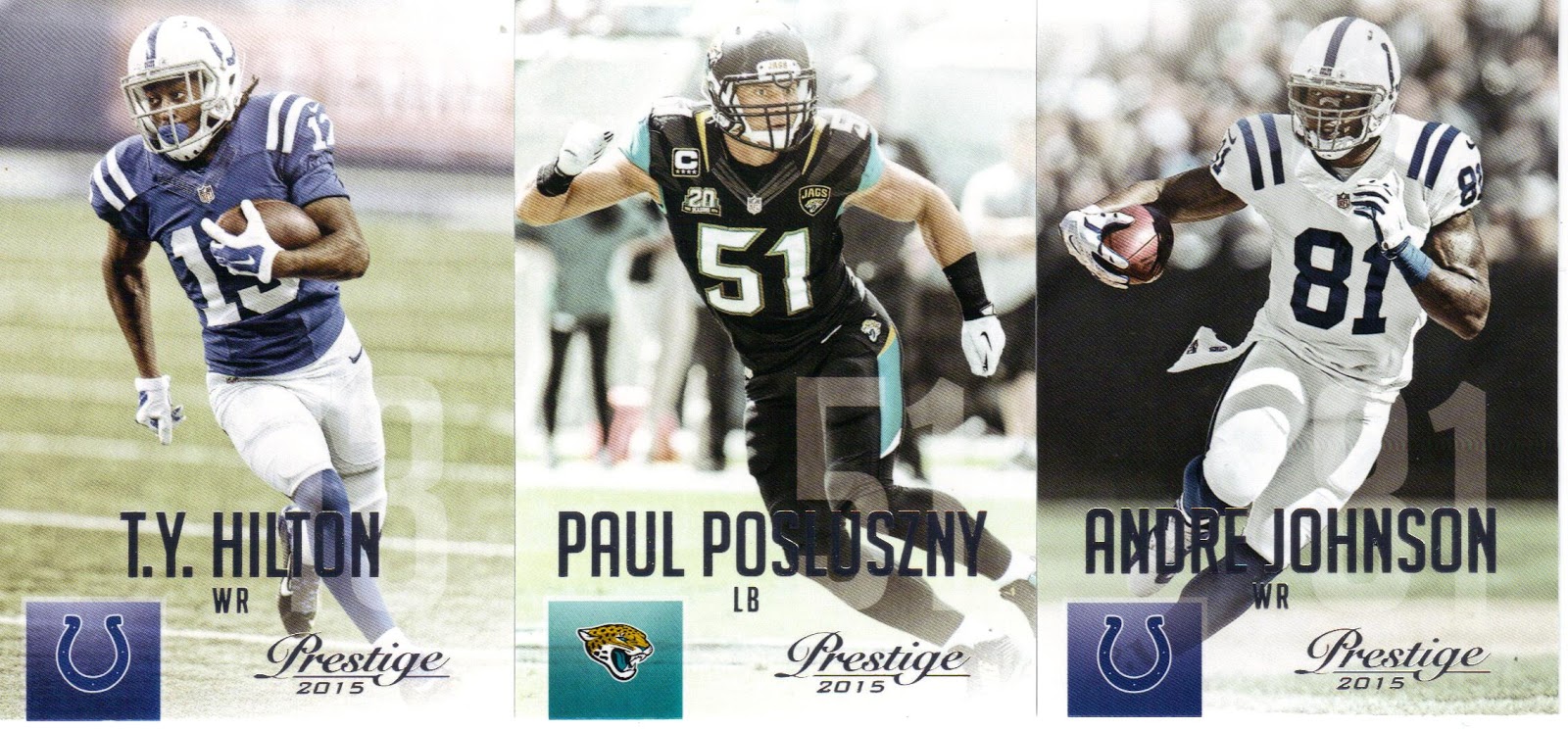
Picked up the Panini Prestige 2015 football cards a few weeks back and want to share my thoughts. I like the fronts except for the halo effect. I think the nice photos are tarnished somewhat by this. At the bottom of the front of the card is the player's name with his position below that and the team logo in the bottom left. The Prestige logo and 2015 round out the front and the bottom right. The rookie cards have the word "ROOKIE" behind the player's photo in white near the top. The rookie fronts also have an RC logo at the top as well as the player's draft position below his name.
The backs are pretty busy. A gray photo is to the left of the back, with a stat ranking in the middle of it. The player's number is in large letters to the bottom of the photo with the team logo. After that, things are pretty helter skelter to the right. The player's info and stats are to the right listed in a vertical fashion. As busy as it is I'm good with what is presented and how it looks. Fairly colorful back that stands out from the norm.
Nice looking cards but I'll admit the halo effect has me wondering whether or not I'll go back for more. That is being picky but anyone who collects knows it can be the slightest of details that cause us to want more of a product. I waffle from day to day so we'll see. No matter because this is a nice set that I think everyone should take a look at.

No comments:
Post a Comment