
2023 Archives: I always enjoy Topps Archives and it's no different this year. These hit our local shelf last week. This 1965 Topps design is my favorite of the three showcased in Archives this year. And you can't go wrong with Randy Johnson on the mound in a D-Backs uni.

Matt Olson was a beast this year. A-Rod was in the day as well and Xander Bogaerts is no slouch. Great looks of all three of these guys.

Randy Johnson stats greatness. Love seeing all the stats on the backs of these cards. The design here is simple but it works.
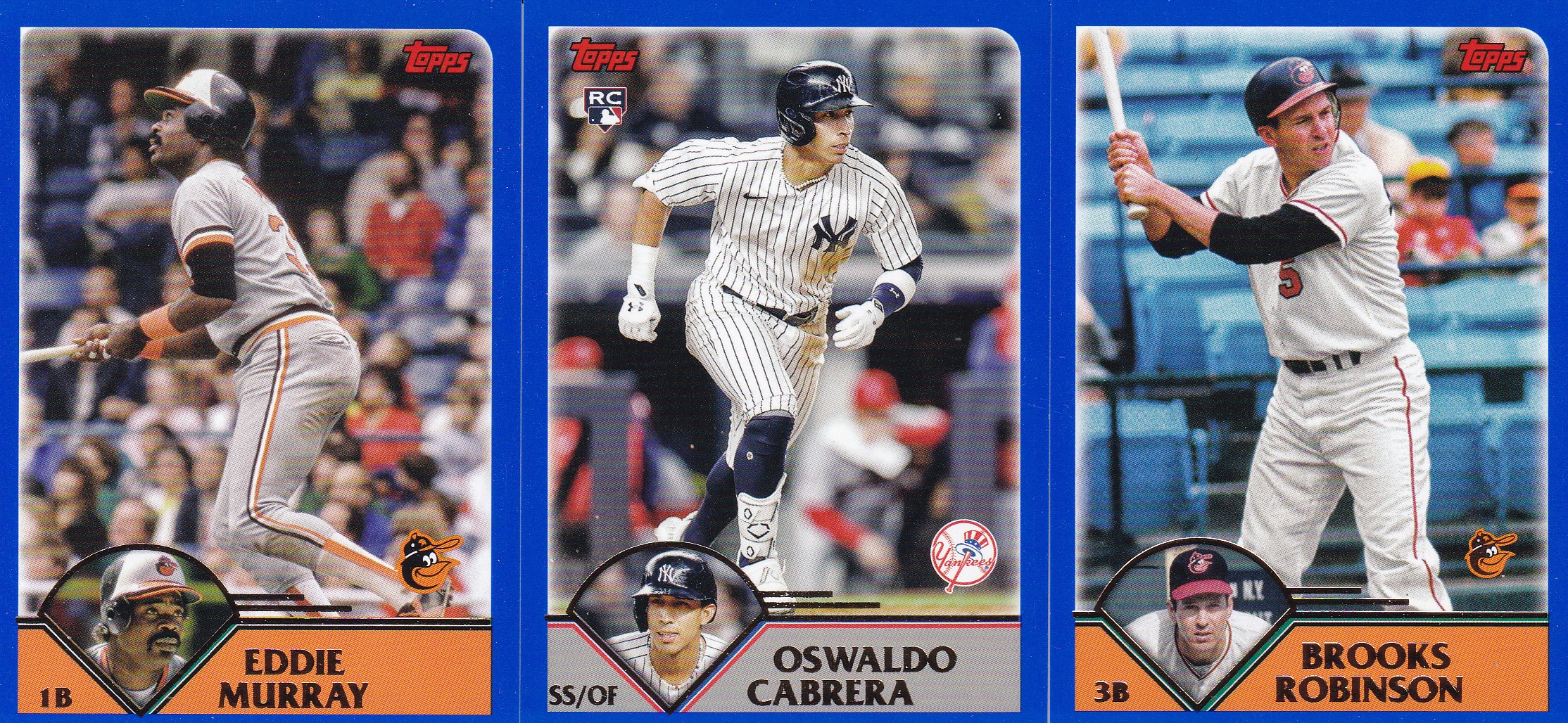
The 2003 cards are intriguing. I'm still trying to figure out how much I like these but I think I'm good. It checks most of the boxes with a logo, nice second photo and plenty of room for nice pictures. The blue border is different. Not bad but different and an interesting choice.

The backs are clean and again show us career stats which are great. Eddie could hit.

Inserts. That Albert Pujols is a 1989 Topps Doubleheader. There is a card of Paul Goldschmidt on the back mirroring the front design. No bad. The Bill Mazeroski is a 1969 Topps Single Player Foil Rainbow while the Miggy card is a 1957 Topps Hit Stars. The '89 is my favorite of these though it wasn't really the best design back in the day.

This 1956 design is one that is growing on me. I really like having two good sized photos here.

Could use a team logo of course.

Simple backs. No lifetime stats but a decent write-up. Brett's career totals are fun to look at. And look at the emphasis on fielding back then.

More youngsters including this Green Parallel Baby Boomers #/99. The Baby Boomers design feels out of place with the Archives brand.

This was a fun box. I'll end it with a personal favorite of mine, Dale Murphy. Hope everyone had a great Thanksgiving.

BREAKDOWN:
56 – Total Cards
18 – 1956
17 – 1965
17 – 2003
13 – RC
11 – Retired Greats
3 - 1969 Topps Single Player Foil Rainbow
1 - 1957 Topps Hit Stars
1 - 1989 Topps Doubleheaders
1 – Baby Boomers Green Parallel #/99
Cool to see 2003 Topps in the set.
ReplyDeleteA set that doesn't get much love for sure.
DeleteA '56-style card without a comic-strip cartoon panel just isn't the same. But I like them anyway.
ReplyDeleteThe Pujols and Murphy cards are really nice.
The Albert card really is nice even with a bland design and torso shot. But I like it.
DeleteYeah, I can't believe they did 1956 cards without the cartoons. Not cool.
DeleteOriginally had no plans to buy Archives... but then I saw it has the 1956 and 1965 designs were are two of my all-time favorites. Now the set is high on my wantlist. Just not sure I want to go the route of building it. I'll most likely just buy a completed set on eBay.
ReplyDeleteCan't blame you. Feels like it would take more buying boxes and trying to build the set.
DeleteMurphy was a Phillies legend, but Olson wins it.
ReplyDeleteYou're killing me. As a Braves fan those were dark times. LOL
DeleteWonder why the Topps logo on the ‘65s and everything else but not on the ‘56s?
ReplyDeleteI don't think there's an answer beyond "poor quality control."
DeleteI really like the 2023 edition of Archives. I am really thinking about trying to build the 1969 rainbow foil card set. I just love the look of that insert set.
ReplyDeleteI'll put that one back for ya!
DeleteWhat other 1969 foil inserts did you get?
DeleteThought there'd be a 4th year in the set. I hope there's more options in retail besides the blaster boxes. Thanks for showing them off!
ReplyDeleteI'm always hoping there will be fat packs with these sets but I only find blasters of it nowadays.
Delete