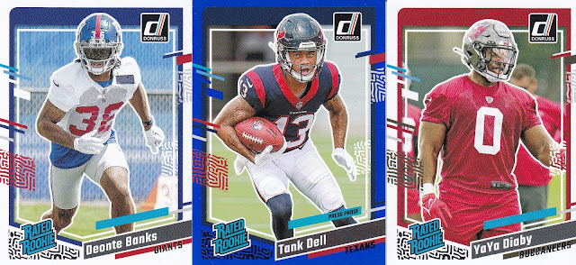
2023 Donruss: This one has been out a few weeks but finally picked it up this weekend. Jalen Hurts and the Philadelphia Eagles are setup to be the #2 seed in the NFC if they can win out and they have a favorable schedule.
The base design threw me off a bit and I couldn't' figure out why. But it's the fact there is a white outline to each player in the photo. Still a bit unsure about it. The design overall is okay. The colored hash marks are good but I'm not sure about the tread marks or whatever those are supposed to be. But I think I like it. We'll see what time has me thinking. I like the Mahomes and Chase cards and photos.
Tank Dell was having a really good rookie season before an injury sidelined him for the rest of the season. That card is also one of the four Press Proof Blue Parallels that come in each fat pack. The design for these is different from the veterans. There is an extra set of "hash marks" on each side of the border.
If you haven't seen Cameron Dicker's video promoting him for the Pro Bowl you are missing out. Great job by him and the Chargers. Go take a look. 300 veterans and 100 rookies make up the base cards.
The backs here are the base design, Champ is Here (spoiler alert) and the rookie base cards. A little color on the base designs but they won't' wow you. Need a logo on the veteran base designs.
No player positions on these cards. They could have easily got those in there in the bottom right corner.
Always fun to get a first look at new cards. The Champ is Here insert set is a great though the Donruss logo really didn't need to be in the middle of the championship belt. They had plenty of options that weren't self serving.
BREAKDOWN:
30 – Total Cards
4 – Rated Rookie
4 – Press Proof Blue Parallel
1 – Champ is Here


They seem too busy to me. "Tread marks" is a good term for the design elements. (At first I though they were fingerprints.) I don't mind those, but all the additional lines make the cards look cluttered. One bit they could have omitted for sure is the "d" for Donruss. And what does "PRESS PROOF" mean? I see that on a few cards, but I haven't a clue.
ReplyDeleteNo idea what they are either. Those are really just blue parallels with press proof on them. Nothing else.
DeleteNot a fan of the card backs. I wish they had more stats. I know this is Donruss... so at the very least they could put the numbers for the past five years (for those NFL veterans).
ReplyDeleteCan't agree more.
DeleteHurts wins it.
ReplyDeleteI like that the player names are easy to read and there's the team logo.
Though, as others have mentioned, they went overboard with the tread marks and they had room for player position in the lower right.
I agree. Some sets where the name is in foil makes you work way too hard just to read the name.
DeleteI have to say that I was not impressed with this year's Donruss football cards. I plan to collect any Steelers cards in the set but that is about all.
ReplyDeleteI'm still out on the base card design that is for sure.
DeleteAs always I am chasing the sweater cards from this set! Lol
ReplyDeleteThose are fun. I'm sure I'll grab a blaster of these at some point and have one to share.
DeleteI picked up a pack a few weeks ago and was bummed that the foil on the front of the card stuck to the back of the card in front of it. Don't know if I want to get more because of it.
ReplyDelete