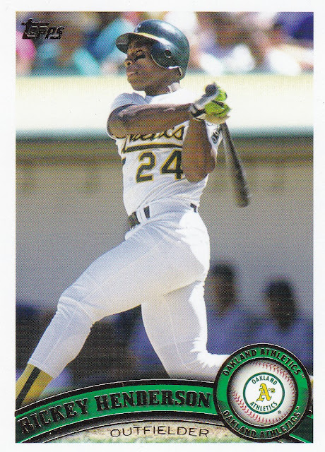
2021 Topps Archives: I really enjoy Topps Archives and this year brings back one of my all-time favorite designs that is 2011 Topps. Add Rickey Henderson to that and this card is a winner in my book. Love the circle with the logo. The colors. It all works for me.
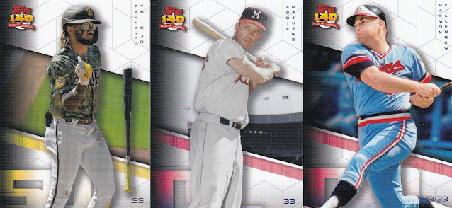
A ton to show off here and I'll just go by design year. They did a futures design with these from "2091". Not bad looking cards actually but no logo? Really?
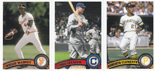
Loving these 2011 cards which have plenty of retired greats. I'll definitely being picking off singles of these.
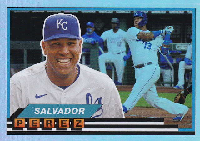
These are Topps Big Foil cards. I'm okay with them but nothing to write home about. Perez is such a beast at catcher!
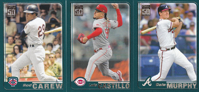
2001 Topps is not one I remember much about as I was out of the hobby at the time. Decent design and seeing Carew and Murph is always a plus.
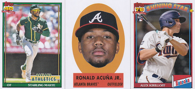
Here you have the mostly forgettable 1991 design (though I like that Marte card with all the A's green), a floating head, and a Bazooka Shining Star.
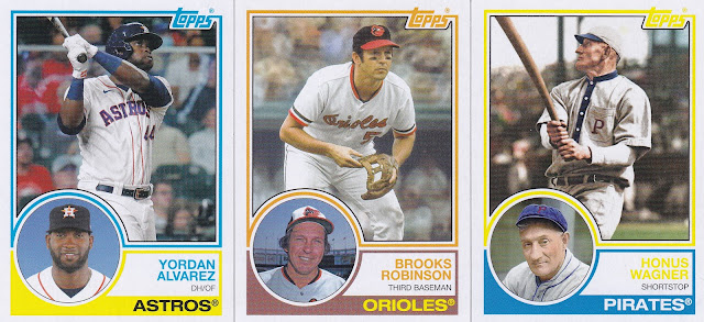
I'm a fan of the 1983 design as well. I like that double photo look.
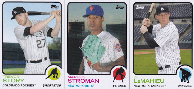
The 1973 design is not my thing but many of the classic Topps designs fall into that category for me.
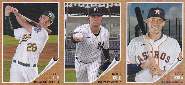
This 1962 design falls into the same category but it is still fun seeing current players on some of these looks from years past.
I like this one a big better. Great seeing Joe Carter included here.
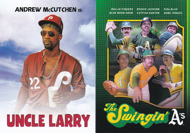
Love these movie poster cards. Uncle Larry is a must have and you can't go wrong with the swag of those great Oakland A's teams. There are plenty of other cool posters in this set I'll be chasing. This was a really fun blaster. My pull was great and while I'm not a huge fan of every design year the variety of what I love. We'll end it with Red great Johnny Bench and his Red Hot Foil Parallel #/50. Perfect color for this legend.
BREAKDOWN:
56 – Total Cards
24 – Retired Greats
9 – 1957
9 – 1962
8 – 1983
7 - RC
6 – 1973
6 – 2011
6 - 2091
5 - 2001
3 – 1989 Topps Big Foil
2 – 1991
2 – Movie Poster
2 – Floating Heads
1 – Red Hot Foil Parallel #/50
1 – Bazooka Shining Stars (1:6)

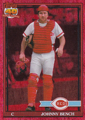
Those Red foils are quite stunning!
ReplyDeleteDefinitely a good look. Just as cool in hand.
DeleteNice red foil Bench. I feel like 73 and 83 were strange choices as 73 will be next year's Heritage design and they just did an insert set featuring the 83 design in 2018. I had to pick up the Uncle Larry single from eBay. Love it!!! I might buy more of them when they pop up on comc eventually.
ReplyDeleteThe Uncle Larry is great. I thought the same thing about the '83 design. I like it but they just did them. I'm already hunting some of the singles I haven't already pulled.
DeleteI like the inserts from Archives. I've not been into the brand since the beginning. Give me the Braves, and I am happy. (I have them incoming already)
ReplyDeleteI had better Braves pulls in subsequent blasters but an Acuna even as a floating head is a good start.
DeleteThat Bench red foil is fantastic! I like the movie poster inserts and hadn't seen the Topps Big foils before. The 1991 and 2011 cards are pulling me in and I might have to puck up a blaster at least. I liked the idea of Topps 2091 (especially since we'll never see it) but the execution is underwhelming. Looks like a Finest design from five years ago :/
ReplyDeleteI agree. I was hoping for more from the 2091 design.
DeleteI have not picked up any Archives yet, but after reading this post, I may have to get some. I really like the design of the various years represented in this year's product.
ReplyDeleteThis is definitely my favorite baseball set of the year.
Delete